
Another Monday, another map type. This time let’s have a go at thematic maps and see if they do any better than topographic or cadastral maps.
Thematic maps are maps showing a specific theme. You may know them from examples such as weather maps showing rainfall or wind, or road maps, or maps of population or sheep.
So, given a map can portray any theme with a spatial component, thematic maps look rather promising. Here’s one, originally drawn for the 1884-5 Berlin Conference by Arthur Silva White (this is an 1891 edition). The Berlin Conference was set up by Germany to shoehorn in on the latter stages of colonisation: all the other major European powers had their share of the world’s bounty, and Germany wanted theirs. The conference actually averted war between the colonial powers (though war eventually arrived in 1914) by divvying up northern Africa.
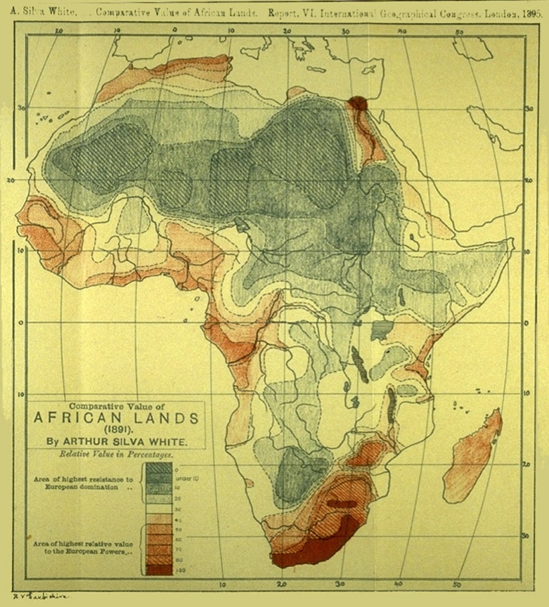
Have a close look at this thematic map, called ‘Comparative Value of African Lands.’ The red colour represents ‘areas of highest relative value to the European Powers’ while the blue areas depict the ‘area of highest resistance to Euroepan domination.’ This map, and others like it, were used to aid the division of northern Africa. And they are a teensy bit racist.
As Col. Thomas H. Holdich said in 1917, “The right of the white man to fill the earth and subdue it has always been unquestioned, because it is based on the principle that his dominance and lordship tend to the betterment of the world.” Alas, Holdich was president of the Royal Geographical Society at the time.
Yes, thematic maps can assume any form and portray any content we choose. But we humans so often choose to portray dreadful stuff like this. Nevertheless, unlike the topographic and cadastral map, where evil is baked in to the map form, the thematic map can be used for good. Here’s a map I drew in the late 1980s:
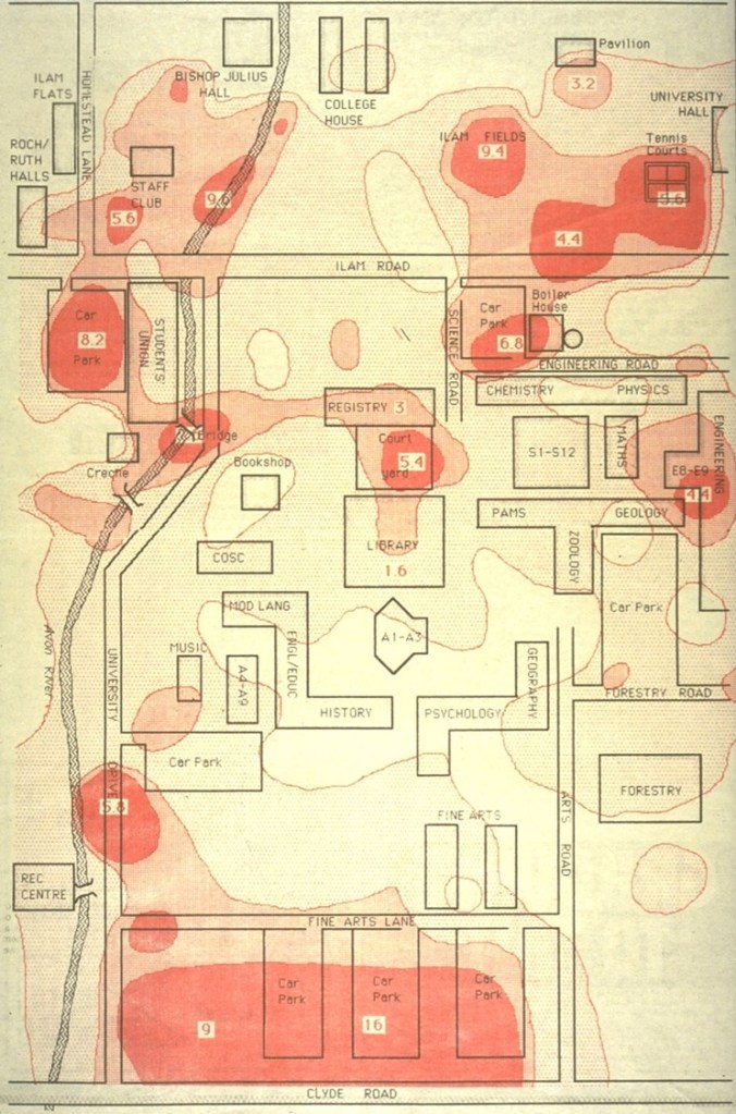
It was drawn in response to a number of attacks on women on the University of Canterbury campus. Students complained to the University council, who would do nothing other than suggest women kept themselves safe (sound familiar?). I collected data from 300 participants who identified places on a map of the university where they felt unsafe, aggregated the data and produced this thematic map of fear.
Upon presenting this to the University council, they immediately reversed their position and decided to do away with the landscaping that kept certain areas dark, and increased lighting around car parks. Yes, now we’d take a different approach, but back then it was definitely a step forward. Of course, the map contained nothing the students hadn’t already said to the council, but the map looked oh so scientific and so garnered the sort of respect emotional women with their feelings could not command. Grrr.
Thematic maps: some potential.
From next week I will discuss alternatives to standard mapping and provide some fantasy examples.

Leave a comment