
OK, buckle in. I promised you some map alternatives and by golly I’m going to deliver them, no matter how much pain I inflict on you in the process.
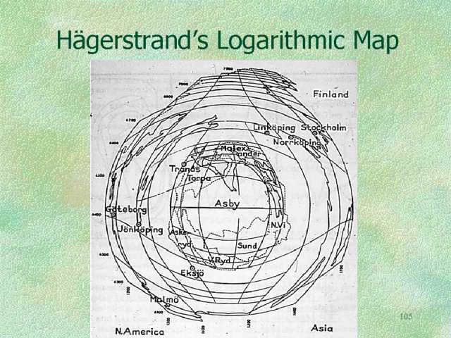
First up is the logarithmic projection. In the 1950s the Lund School, a group of visionary geographers, tinkered with what was possible, and Torsten Hagerstrand came up with a logarithmic map (Figure 1). It acts a bit like a fish-eye lens, enlarging the central section and conversely shrinking the margins. This is done by the use of logarithms which, simply put, reduce each ‘step’ in map distance from the centre by a factor of ten. So if the central 1cm on the map equals 1km in reality, the second out from the centre equals 10km, the third 100km and so on. How this affects a map of Sweden, Hagerstrand’s home country, is shown in Figure 2.
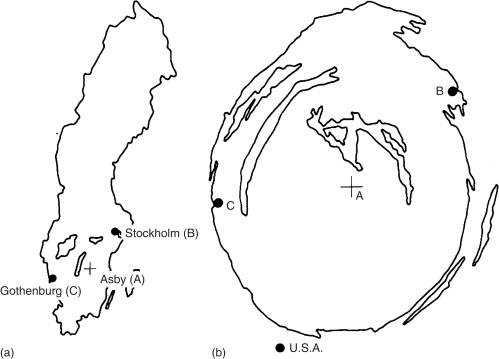
These were largely a curiosity with no practical use until the late 1980s, when I suggested they were a perfect way of incorporating “egocentric” data into cartography. Standard cartography uses scale to tell us that all places are equal (which is undermined by maps such as the Mercator projection, which distorts scale away from the equator), whereas the logarithmic projection can show a map with places of importance to the subject enlarged – which is pretty much the way we see the world anyway. People asked to draw a sketch map of their own home area tend to enlarge the places they know and compress those they don’t. The assumption here is that the centre of the map contains the places of most importance, which isn’t always true, but the cartographer just has to redraw the map to the user’s nominated centre for it to work.
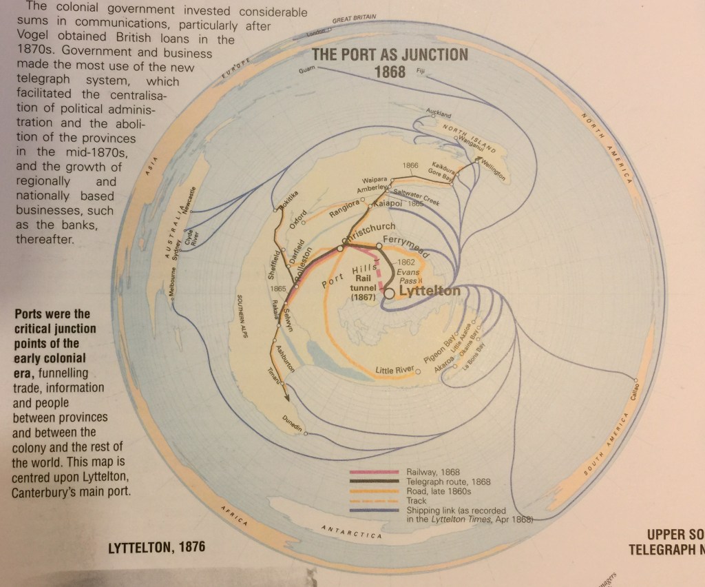
The logarithmic projection, therefore, has a use in subverting the standard impartial cartographic gaze, making maps personal and local. Here’s an example I used in a formal setting, a map of nineteenth century New Zealand connections to the globe (Figure 3). The idea was to show the interconnectedness of local places, such as Saltwater Creek and Akaroa, to global destinations in 1868. No other kind of projection could have done this, as the local detail would have been lost on a standard map of the world. The trade-off, of course, is the familiar shapes of the other continents are distorted – but they are of secondary importance in this story.
I hope already you can see how this might be used in fantasy mapping.
No? Here’s an example I call the Bronze Map. It appeared in Beyond the Wall of Time, the final volume of my Husk trilogy, published in 2009/10. This is a magical map created by God’s children. The map would transform around whoever held it, placing them in the centre and exaggerating the local area, conversely minimising the margins. The ‘real’ fantasy world is shown in Figure 4, while the Bronze Map is Figure 5. The fortunate person possessing the Bronze Map just had to touch any other place on the map to instantly travel there, and the map would reform around this new centre. In Figure 5 it is centred on the Godshouse, where the God’s children grew up.
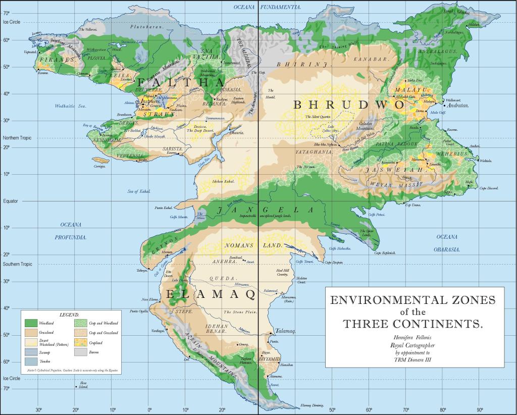
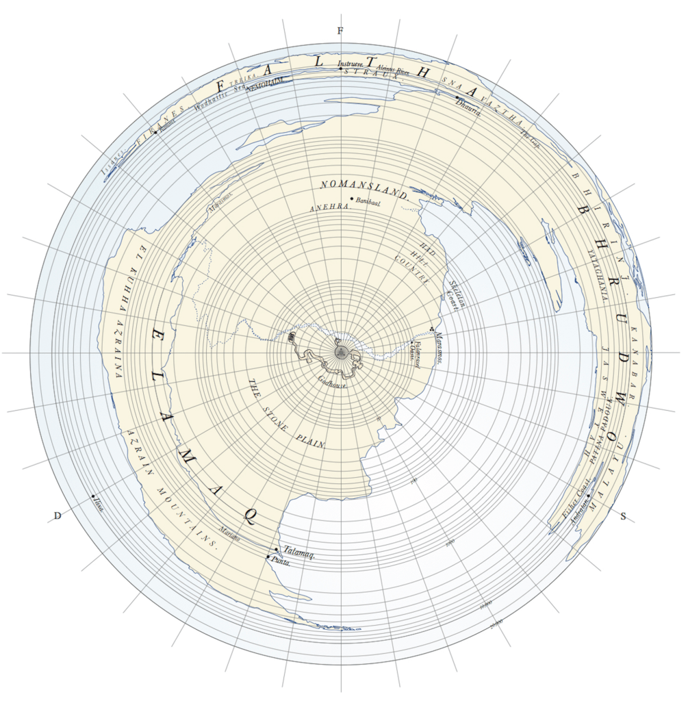
Hopefully you’ll be able to see that the two maps cover exactly the same territory, the three continents, but with quite different results. The wiggly line in the centre of the Bronze Map is the Godhouse, which is not visible on the standard Three Continents map. The trade-off is that while Elamaq, the third continent, is almost recognisable, the first two continents (Faltha and Bhrudwo) are squished.
I’d like to see more of these, and I’m attempting to work one into my latest novel in progress.

Leave a comment