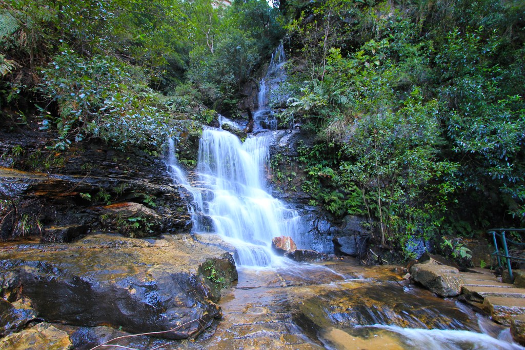
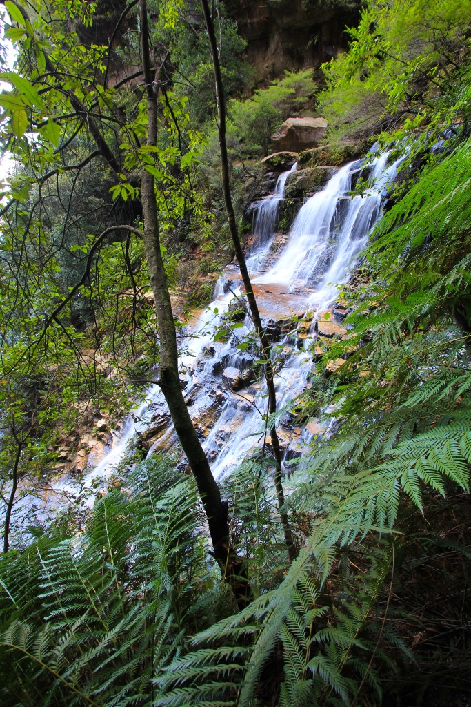
Today, on the increasingly poorly-named Waterfall Wednesday, we continue down into the Valley of the Waters, a stream slicing through Australia’s eastern escarpment between Katoomba and Leura in the Blue Mountains.
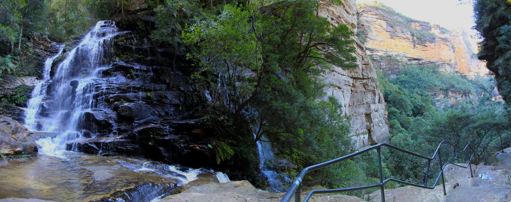
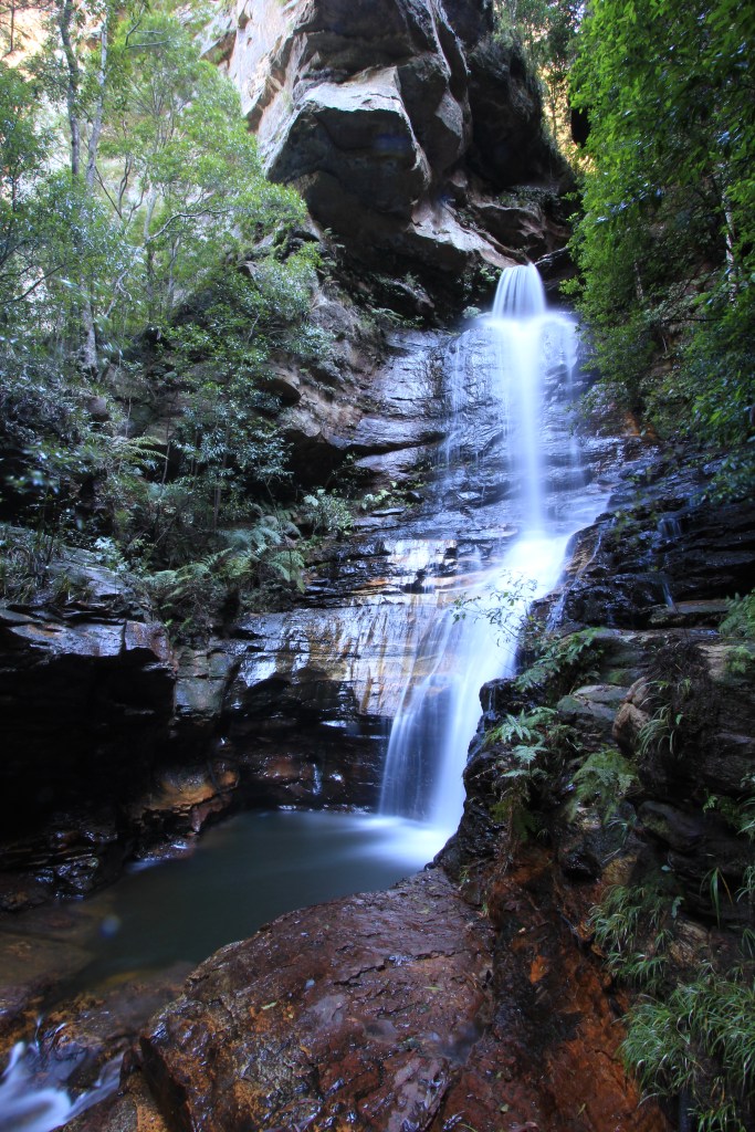
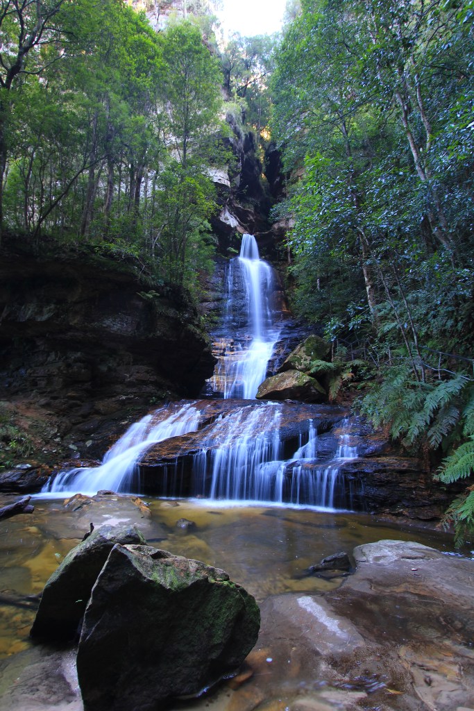
A few steps downstream from the gorgeous Sylvia Falls (featured last week, go look at my post if you haven’t seen it) are two further waterfalls. I’m uncertain of their names, so let’s call them Middle Sylvia Falls and Lower Sylvia Falls. Whatever they’re called (and I’d really appreciate knowing), they’re quite beautiful and complement the two falls we’ve already seen on our journey.
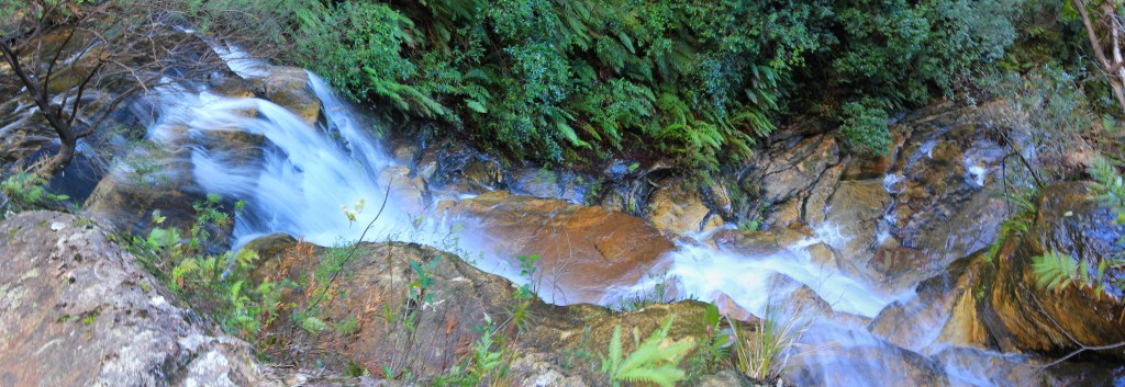
Middle Sylvia Falls from the track.The upper part of Middle Sylvia Falls from above
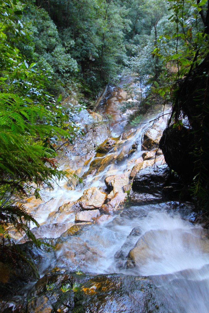
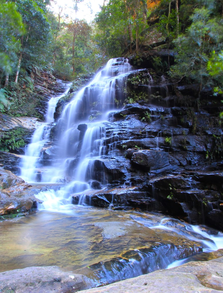
Middle Sylvia Falls is a small cascade just above where the track crosses the stream, and Lower Sylvia Falls is, well, just below. On one of the days I went the light was perfect and the stream luminescent, making for great photos. Enjoy the richness of rock, water and leaf.
Lower Sylvia Falls from above. Bet those rocks make a lovely waterfall when viewed from belowYep, they do!Love me some fern fronds!
Today’s alternative
cartographic form, the oblique perspective, is one everybody will recognise. It’s
been around for as long as people have been drawing landscapes. My role in the
development of this technique has been to provide an academic justification for
it.
In the late 1980s I came across an obscure publication by a Scandinavian author, Janos Szego, called ‘Mapping the World of Man’ (sic). In it he conceptualised space-time as a three-dimensional shape. I was immediately aware of the relevance for cartography. I’ve found the most effective way of communicating this concept is to use a can of food from the pantry. Bear with me here! Grab a can and follow along!
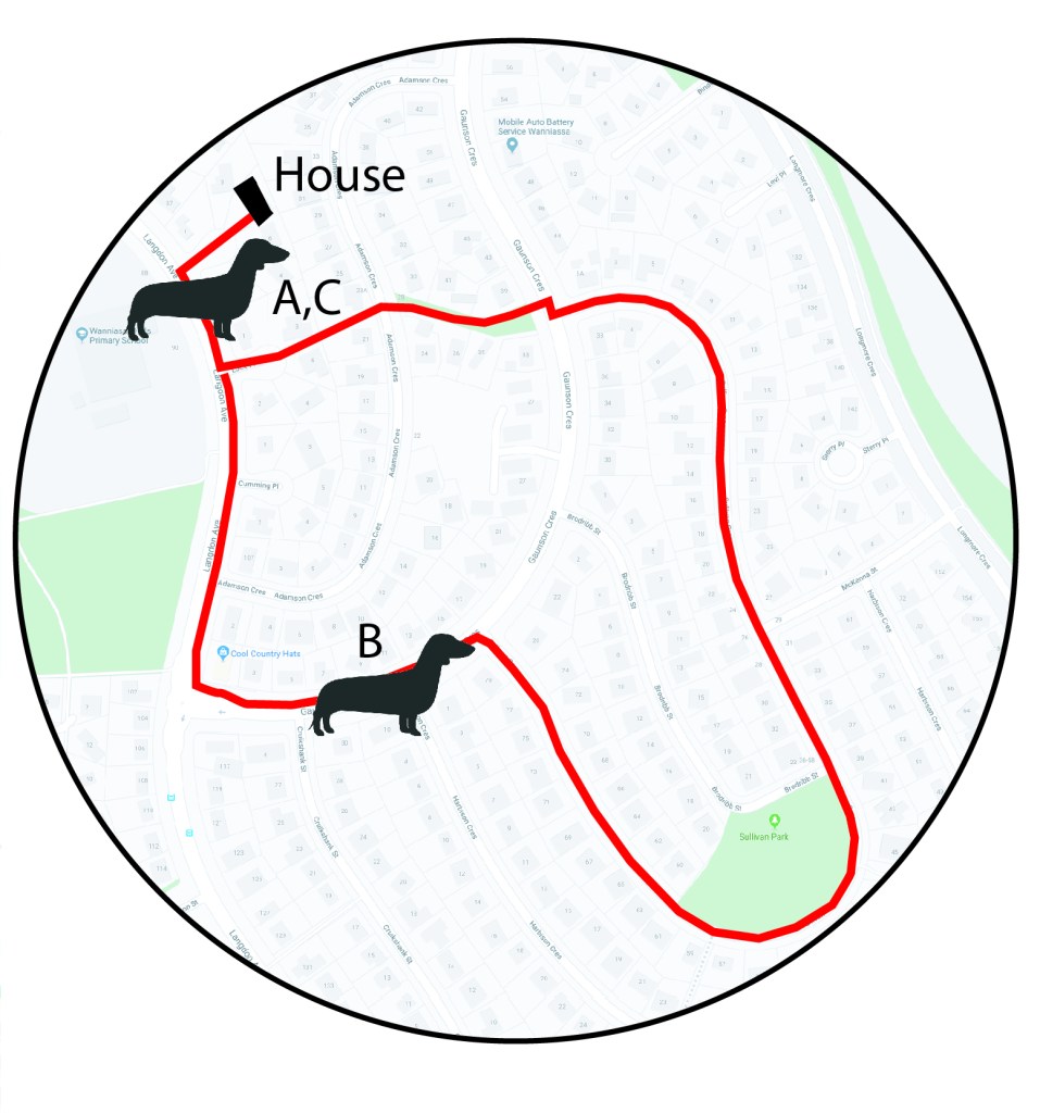
OK, hold the can so you can only see the top. It should describe a perfect circle (unless it’s badly dented, in which case throw it away, because those dents can damage the seams and allow bacteria in). See the circle? Let’s call that ‘space’. Imagine it’s a little circular map of the present, focused on your house, like Figure 1:
Figure 1: Rogue’s dog-walking space mapped on the top of a can of food. Why not?
This is actually my dog-walking route, sadly neglected of late. My house is up in the top left of the map. (Coincidentally the route is shaped like a dachshund’s head.) This circle functions like a normal map, with the viewer looking down on the earth with a god’s-eye view. The dachshund silhouette is my dog Rogue, in the same place at the beginning and end of the walk (A and C) but in different locations during the walk (eg B).
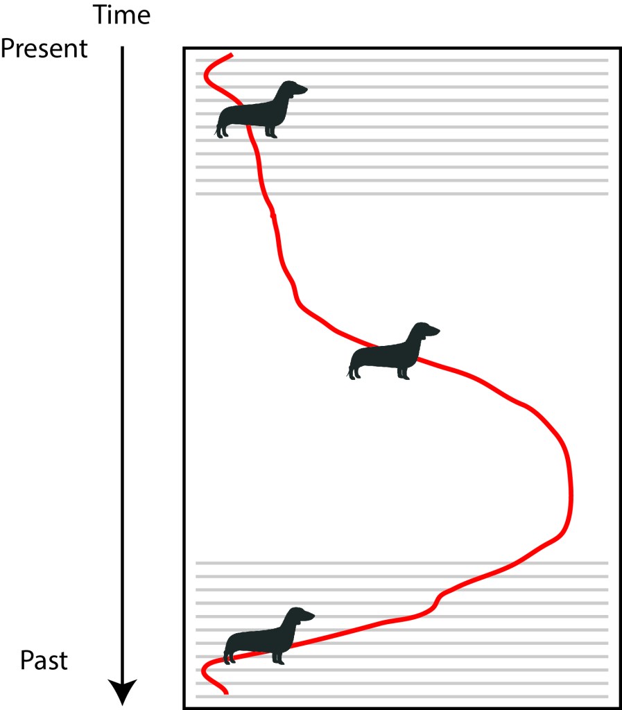
Now turn the can so you are looking side-on, like Figure 2. Now you can’t see ‘space’ at all. What you’re seeing is ‘time’ – all the previous spaces stacked on top of each other, from the distant past at the bottom to the present on top. If you could slice horizontally through the can, discard the top part, and then turn the can so you were looking down on the the remains, you would see the ‘space’ but at some point in the past. (Or messy food spilling out.)
Figure 2; Rogue’s dog-walk through time, mapped on to the side of a can of food.
My dog-walk becomes a line through time, from the beginning of the walk at the bottom, to the end of the walk at the top. In this example A and C are at different times, so Rogue appears at the beginning and end of the walk at different places on the can.
Thus the vertical
view shows space, and the horizontal view shows time. Now, hold the can at an
angle so you can see both the top and the side. You are now viewing an oblique
perspective, and you are, in effect, seeing both space and the implication of
time. (This is the hard bit to get your head around.) An oblique perspective
implies time, and is best used when mapping a journey – like we find in many
novels, especially fantasy novels.
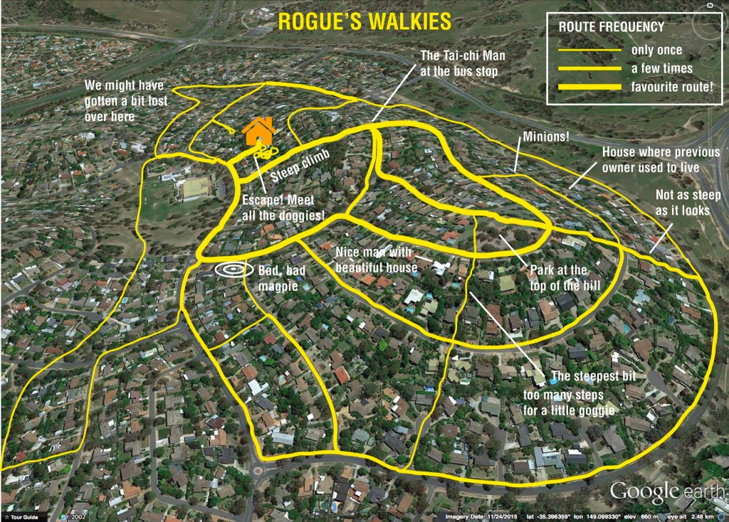
Figure 3 is an oblique perspective I drew a few years ago, showing Rogue’s dog-walking route. To achieve the effect of what Szego calls ‘procedural space’, any formal idea of scale has to be sacrificed, but we gain a sense of time (in that some parts of the map are further from the viewer’s eye than others). This is the principle upon which Satnav displays work: the viewer ‘proceeds’ from the bottom of the map into the map, with the destination in the distance, at the top. That’s an oblique perspective.
Figure 3: Rogue’s Walkies, an oblique perspective in space-time.
Cool story
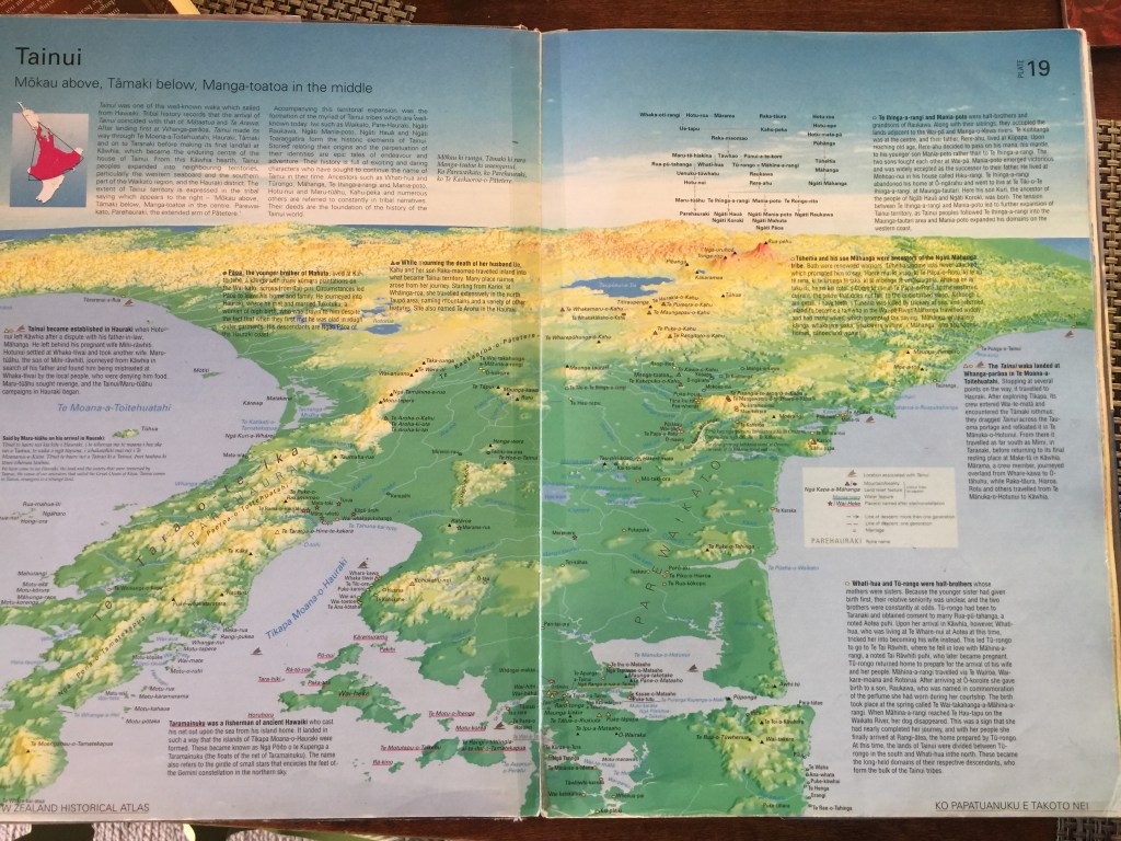
bro, but is it usable? Well, yes. In the 1998 New Zealand Historical Atlas we
faced the challenge of mapping Maori spaces without resorting to formal western
top-down, god’s-eye Euclidean space. I came up with the oblique perspective for
the maps of Maori spaces, one of which is (poorly) reproduced here as Figure 4.
The journeys of Maori ancestral heroes are mapped in detail on a sympathetic
projection.
Figure 4: Plate 19, New Zealand Historical Atlas: Tainui.
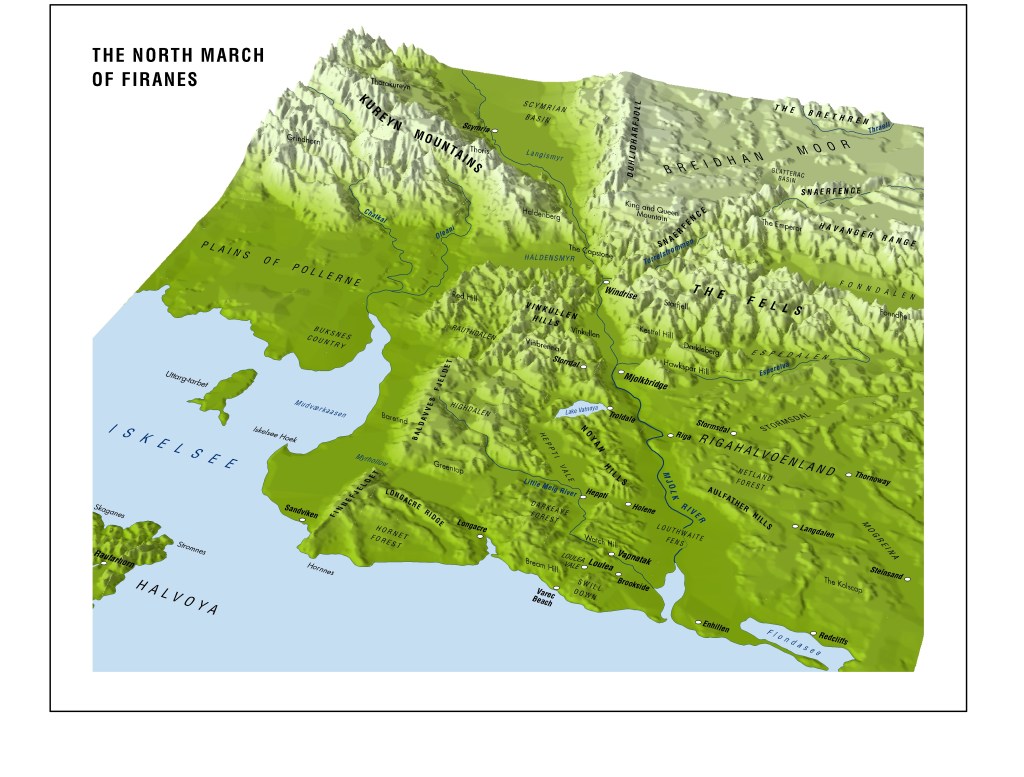
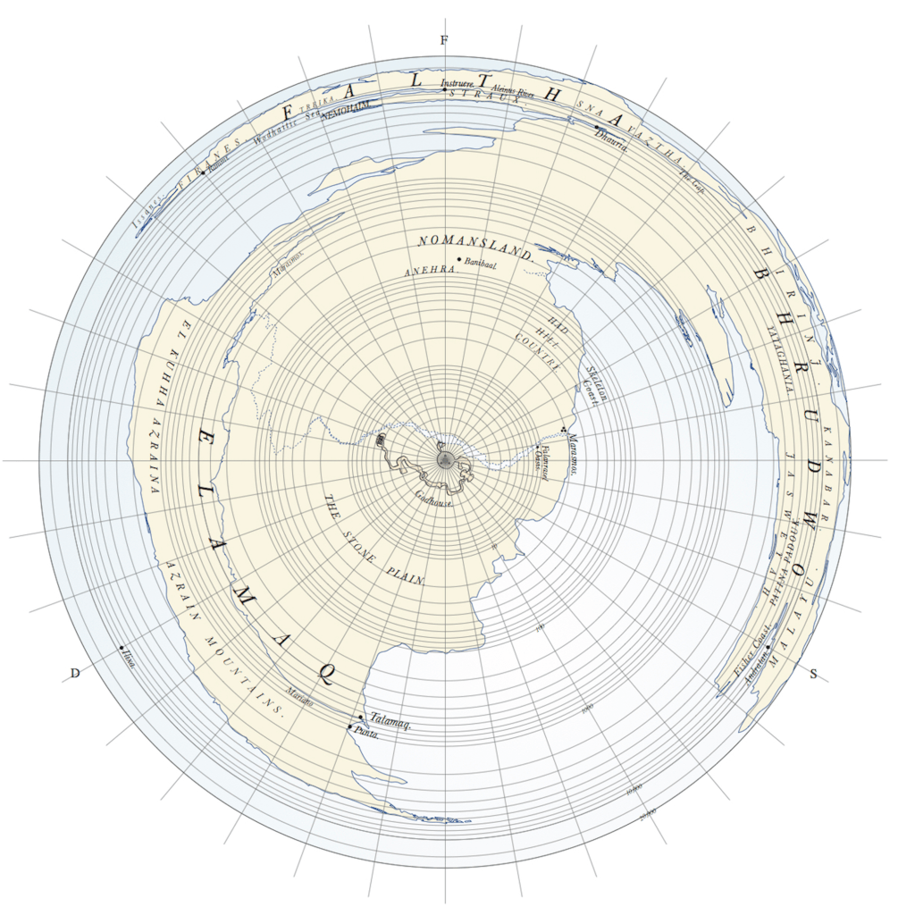
And in fantasy novels? Not so much, though I have used them occasionally. Figure 5 is from my debut Across the Face of the World, inviting the viewer to move from the bottom of the map into the wilderness. Just like a satnav.
Figure 5: The North March of Firanes, from Across the Face of the World (2004).
Well, that
took forever, and I’m not sure if I nailed it. You can put the can down now.
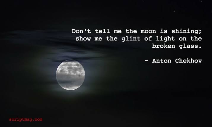
“Show, Don’t Tell”? What an utterly ruinous piece of advice. The problem isn’t in the “show” – we should be showing our readers all the things. Giving them a chance to experience things for themselves, letting them get inside the skin of our characters, encouraging them to feel the broken glass under their torn feet and smell the spicy food simmering on the grill.
No, the
problem is in the “don’t tell.” Sonya Huber’s wonderful article “The Three
Words that Almost Ruined Me as a Writer” reminds us of the problematic history
of “don’t tell” – the secrets it hides, the abuse it encourages. The powerful
ideas it stifles. The voices it hides.
“[Creative writing students may be] dog-paddling in private dunk-tanks of terror or depression, and they are trained already to anxiously do what they are told. They might only have stories of vague fog, the un-showable. They need to believe that interior monologue and private thoughts matter. That thinking differently, that considering, is as important as action.” (Huber, 2019).
The awful “show, don’t tell” advice means well. It’s designed to focus the writer on character rather than exposition and plot. It’s a staple of creative writing courses and late-night wine-soaked author discussions.
This advice comes from our writerly obsession with screenplays. We get our story beats from movies, we dart in and out of our narratives at will, showing and hiding. We write scenes rather than chapters. We discard the beautiful omniscient point of view and only show the things our protagonists can see. The spring melt of a giant waterfall, unobserved by any human, cannot be featured in our stories. If a tree falls in our story forests, and no one is around to hear it, we can’t tell you about it. The crash and echo is lost.
It’s time we put aside our obsessions with the screen and began re-engaging with the page. Broaden the scope of our story-telling. Pass comment, pass judgement. Resist any three-word slogan designed to narrow the scope of our craft. In the end it’s not enough to use our imperfect little mirrors to show people what’s happening, we must also tell them.
Your new entrant’s class had it right: “Show and Tell.” Bring something interesting along and tell us about it – and, in doing so, tell us about yourself and ourselves.
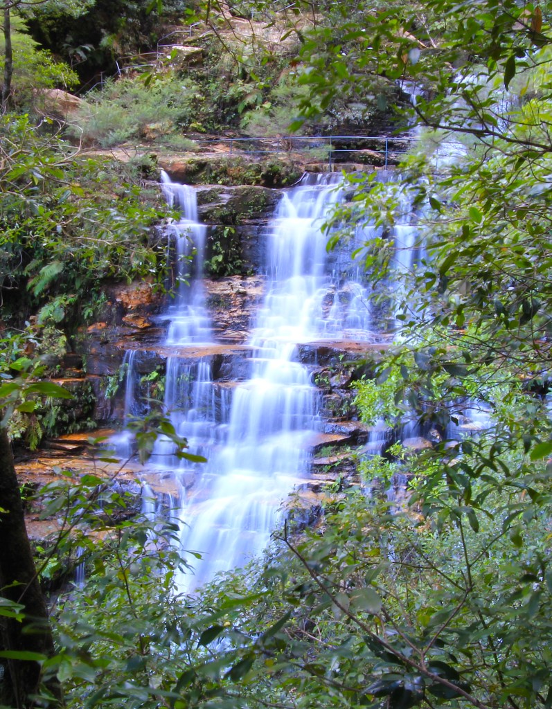
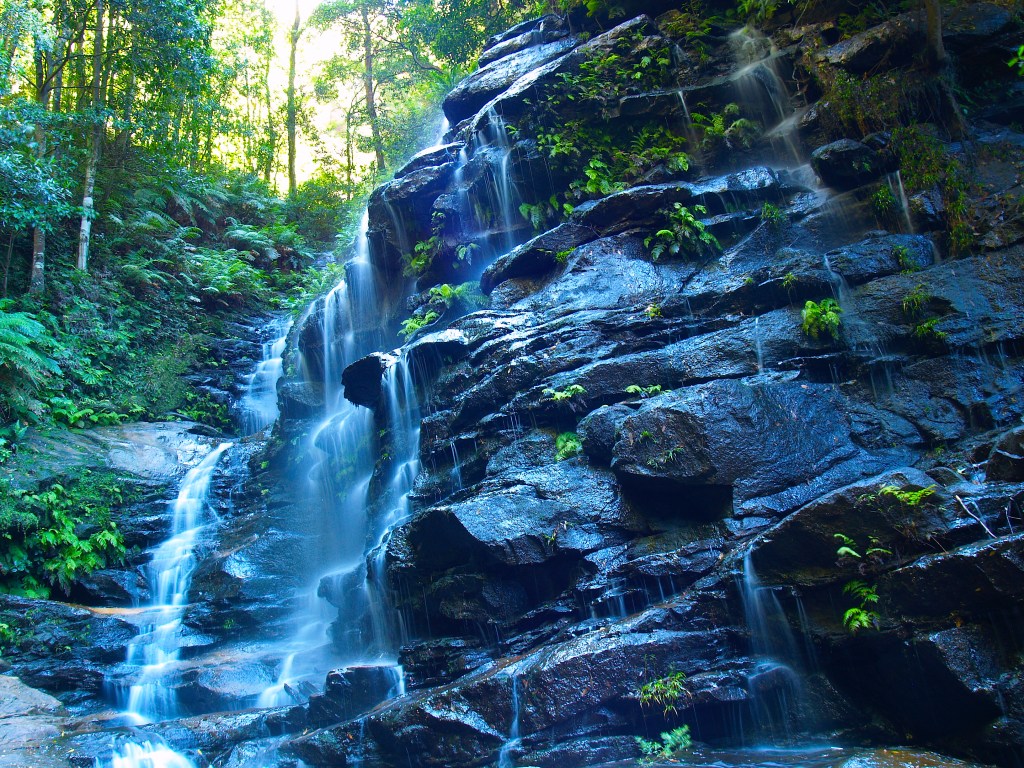
It is my
great pleasure to introduce you to Sylvia Falls, the second of the many
waterfalls you encounter as you work your way down the Valley of the Waters in
the Blue Mountains. Small rather than grand, it ticks all my boxes and to me it’s
the highlight of the valley.
The first
time I visited this fall the water seemed to glow a bluish white, and although
there was not a great deal of water, a few-second exposure captured the essence
of the place. I set the image at a slight angle to emphasise the many small
rivulets running over the black rock of the escarpment. It’s one of my
favourite waterfall photos.
Sylvia Falls in low flow
When I
revisited the scene a couple of years later, I tried to capture Sylvia Falls in
its context, with the upper escarpment wall in the background. Even the best of
lenses couldn’t fully compensate for the difference in light between the grotto
in which the fall is set and the sun-drenched cliffs in the background, but I
did my best. I imagine some post-processing could improve it.
Sylvia Falls and escarpment, Valley of the WatersSylvia Falls with better flow
Next in my series of cartographic alternatives to standard maps, with their deeply encoded messages, is the schematic map.
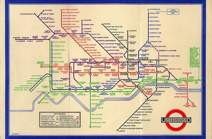
Probably the most well-known example of a schematic map is the Tube Map, the map of the London Underground. Developed in 1931 by Harry Beck, this map simplifies a horrendously complicated three-dimensional railway network to a series of lines and connections. Figure 1 shows pre-1931 maps of the underground, while Figure 2 is Beck’s effort.
Figure 1: pre-1931 London Underground mapFigure 2: a 1933 version of Harry Beck’s London Underground schematic
The map
works because it ignores geography. Who cares about absolute distance and
direction? All you want when you take the tube is the connections. Where do I
get on? Where do I change trains? Where do I get off? And because I’m
underground, the geography doesn’t matter anyway.
Traditional
cartographers almost never think of using this technique, because they are deeply
ingrained with the falsehood that physical reality is the ‘real’ reality. Harry
Beck had no such falsehood clouding his brain, because he wasn’t a cartographer
at all: he was an electrical engineer. What you’re looking at, people, is a
wiring diagram.
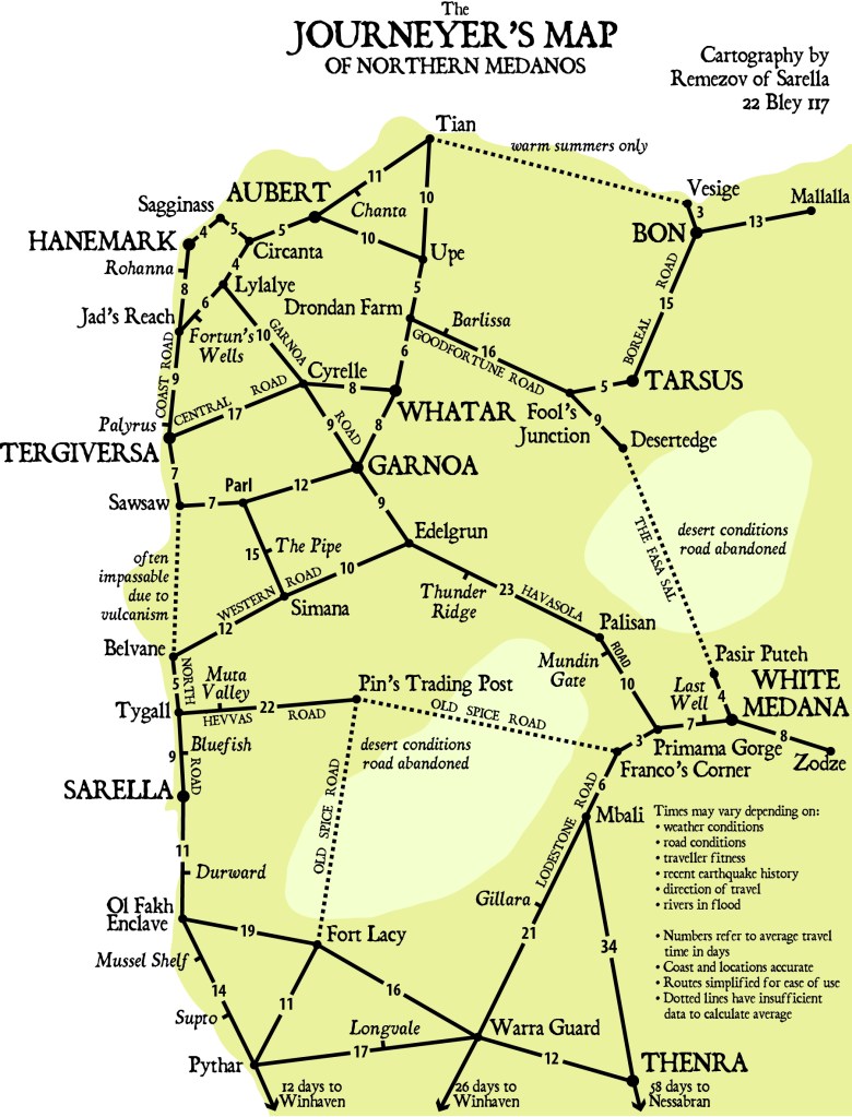
I’ve already shown you one example of this technique in my upcoming fantasy novel, Silent Sorrow; but, now I’ve named and explained it, here it is again (Figure 3). It is a schematic showing time-distance between major centres in northern Medanos, designed by Remezov (the protagonist) to help choose the best routes – because how long it takes to travel somewhere is more important (and often different) than how far it is.
Figure 3: Remezov of Sarella’s schematic of Northern Medanos Travel Times
A better cartographer than Remezov (and one of his friends is better, not that he knows this yet) will improve this map further by making the length of the lines proportional to the number of days’ travel the line represents. Who this cartographer is, and how talented she is, will shock him. Good. He needs shocking.
So,
logarithmic projections and schematic maps are two viable alternatives to
standard cartography. Next week: oblique perspectives.
Chatting
with a couple of good friends last night about Impostor Syndrome and how it can
paralyse a person just when they most need confidence.
Impostor
Syndrome is the fear of people finding out you don’t have the skills people
believe you have. Its most pernicious trait is that external evidence of
competence does not help.
Image: Randall Munroe, XKCD.
You can experience the syndrome anywhere. Some people suffer it in their deepest relationships. Others suffer it at work or school. Everyone who’s ever graduated has experienced it. And most writers suffer from it at times during their career.
I’m reasonably realistic and level-headed about my abilities. I’m not the best writer, I’m not the worst. I can remember discussing this in a convention panel and suggesting we’re not as good as we wish, and not as bad as we fear. It’s advice that has stayed with me.
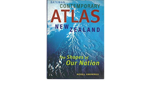
I needed that advice the day my first atlas was published. I went to Whitcoulls in town so I could see it on the shelf, and lurked for a while near the atlas section. Eventually a woman picked my atlas out of the shelf oooh oooh oooh and the salesperson came rushing over. “Oh no, you don’t want that,” she said. ‘You want a proper atlas,” and led the customer to another shelf, leaving me believing the whole thing had been a big mistake.
My first book published under my own name: Contemporary Atlas New Zealand, 1999.
The major contributing factor to the widespread incidence of impostor syndrome in writers is, in my opinion, the nature of the industry. It feels like it makes adversaries of us all: authors vs agents, agents vs publishers, publishers vs readers and every permutation of each. It’s a sad fact of capitalism that we are encouraged (and sometimes forced) to compete for dwindling resources. Further, it’s in the interest of the industry to promote the idea that getting published is an amazing achievement, so rare as to be akin to being struck by a meteorite. No wonder we feel like impostors! Whose ego, no matter how robust, can bear the burden of such fortune? People must expect a superbeing, we tell ourselves, an impossible combination of talent, glamour, energy, erudition and humour. And once this unrealistic ideal is implanted in our minds (often based on a pastiche of successful authors), it becomes real and we the impostor.
How do we counter this affliction? I believe the most effective way is to be honest with others. Find writer friends to talk to and listen carefully to them as they share about themselves. Let the realisation that they are not superbeings sink in. They are not superbeings, and you do not expect them to be: so extend the same courtesy to yourself.
The most well-known section of Australia’s eastern escarpment is the Blue Mountains. Katoomba is the hub, sited above the Jamison Valley and the Three Sisters and all the touristy views. The area is home to many beautiful waterfalls and I have barely scratched the surface in my few visits there.
The first port of call for waterfall lovers is the Valley of the Waters, a descent from the plateau to near the base of the escarpment, walking past half a dozen waterfalls. I will feature these over the next few weeks.
The uppermost fall is Empress Falls, reached by a steep descent from a car park. It’s pretty and mostly enshadowed, making it an easy mark for waterfall photographers. One of the times I visited it was almost luminous – some quality of the light, or something in the water, I’m not sure which – and the two photos here are from that visit.
No barriers to keep you away, so you can frame your photo.
Like all waterfalls in Australia, try to time your visit a few days after rain. Pointless dribbles otherwise.
There’s a lovely glow in the pool and the fall itself is bright against the shadows of the dell.
OK, buckle in. I promised you some map alternatives and by golly I’m going to deliver them, no matter how much pain I inflict on you in the process.
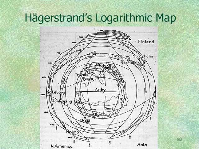
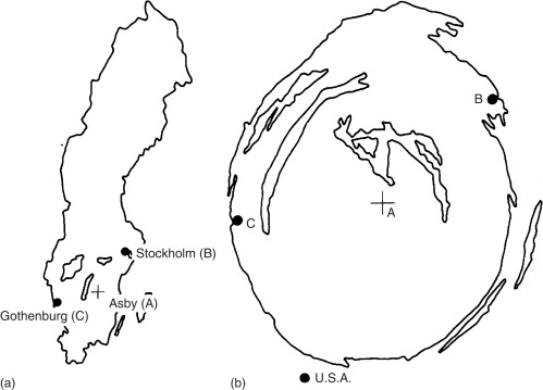
First up is the logarithmic projection. In the 1950s the Lund School, a group of visionary geographers, tinkered with what was possible, and Torsten Hagerstrand came up with a logarithmic map (Figure 1). It acts a bit like a fish-eye lens, enlarging the central section and conversely shrinking the margins. This is done by the use of logarithms which, simply put, reduce each ‘step’ in map distance from the centre by a factor of ten. So if the central 1cm on the map equals 1km in reality, the second out from the centre equals 10km, the third 100km and so on. How this affects a map of Sweden, Hagerstrand’s home country, is shown in Figure 2.
Figure 1: source: ncgia.ucsb.eduFigure 2: The outline of Sweden, ‘normal’ and Logarithmic
These were largely a curiosity with no practical use until the late 1980s, when I suggested they were a perfect way of incorporating “egocentric” data into cartography. Standard cartography uses scale to tell us that all places are equal (which is undermined by maps such as the Mercator projection, which distorts scale away from the equator), whereas the logarithmic projection can show a map with places of importance to the subject enlarged – which is pretty much the way we see the world anyway. People asked to draw a sketch map of their own home area tend to enlarge the places they know and compress those they don’t. The assumption here is that the centre of the map contains the places of most importance, which isn’t always true, but the cartographer just has to redraw the map to the user’s nominated centre for it to work.
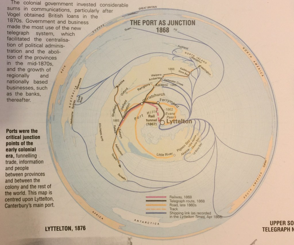
The logarithmic projection, therefore, has a use in subverting the standard impartial cartographic gaze, making maps personal and local. Here’s an example I used in a formal setting, a map of nineteenth century New Zealand connections to the globe (Figure 3). The idea was to show the interconnectedness of local places, such as Saltwater Creek and Akaroa, to global destinations in 1868. No other kind of projection could have done this, as the local detail would have been lost on a standard map of the world. The trade-off, of course, is the familiar shapes of the other continents are distorted – but they are of secondary importance in this story.
Figure 3: The Port as Junction, New Zealand Historical Atlas, Plate 52.
I hope already you can see how this might be used in fantasy mapping.
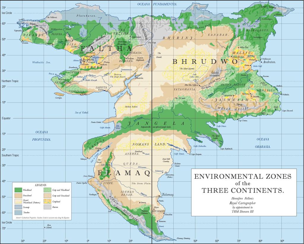
No? Here’s an example I call the Bronze Map. It appeared in Beyond the Wall of Time, the final volume of my Husk trilogy, published in 2009/10. This is a magical map created by God’s children. The map would transform around whoever held it, placing them in the centre and exaggerating the local area, conversely minimising the margins. The ‘real’ fantasy world is shown in Figure 4, while the Bronze Map is Figure 5. The fortunate person possessing the Bronze Map just had to touch any other place on the map to instantly travel there, and the map would reform around this new centre. In Figure 5 it is centred on the Godshouse, where the God’s children grew up.
Figure 4: The Three Continents, from Beyond the Wall of Time, 2009.Figure 5: The Bronze Map, from Beyond the Wall of Time, 2009
Hopefully you’ll be able to see that the two maps cover exactly the same territory, the three continents, but with quite different results. The wiggly line in the centre of the Bronze Map is the Godhouse, which is not visible on the standard Three Continents map. The trade-off is that while Elamaq, the third continent, is almost recognisable, the first two continents (Faltha and Bhrudwo) are squished.
I’d like to see more of these, and I’m attempting to work one into my latest novel in progress.
Today I reveal the ten rules that will turn your poorly-written story into a cultural and sales behemoth. Follow these simple rules and you will stride across the literary landscape like a colossus. Fortune and fame will fall at your feet. Ready? Here we go.
Rule 1: there are no rules that
ensure success.
Rule 2: anyone who says otherwise
wants to sell you a book. Look them up; I guarantee they’ve written a ‘how-to’
book.
Rule 3: rules stifle creativity.
Rule 4: though, to be fair, there
are certain things all best-selling and wellbeloved stories have in common.
Rule 5: like, for example, they
were completed. You gotta do that. No-one’s going to raid your bedside table
for that half-finished manuscript and sell it to Penguin on your behalf.
Rule 6: although I bet that’s
happened at some point. If I stop typing this frivolous list and go look it up,
I’m sure I can find an example.
Rule 7: no I couldn’t, though I didn’t
look very hard.
Rule 8: seriously, though,
getting a story published is like buying a ticket in the lottery. You might think
you’ve made it when you get published, but it’s like the Upside Down out there
in publisher land. Who knows what’s going on? Only that it’s loud and confusing
and things vanish without trace.
Rule 9: since you’re still
reading, here you go: come up with an idea that isn’t wholly derivative, give
your idea a distinctive voice and get someone to make a good cover.
Rule 10: oh all right, you wanted
advice. I can only offer Sir Terry Pratchett’s advice, as told to Tiffany
Aching by Miss Tick, a witch and itinerant teacher: “If you trust in yourself,
and believe in your dreams, and follow your star, you’ll still get beaten by
people who spent their time working hard and learning things and who weren’t so
lazy.”
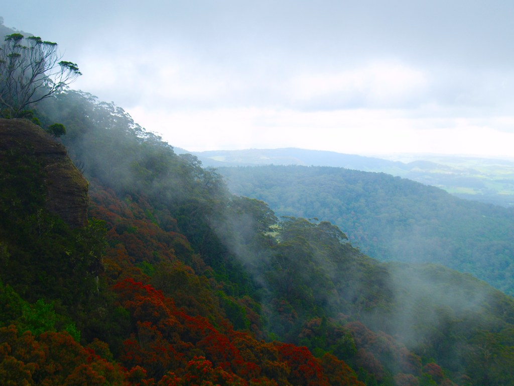
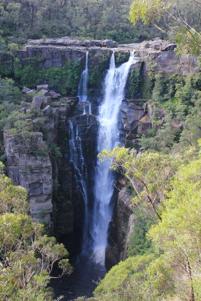
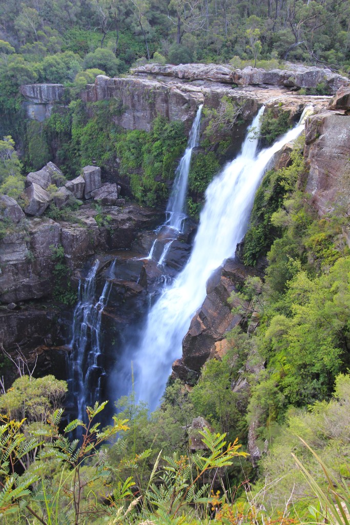
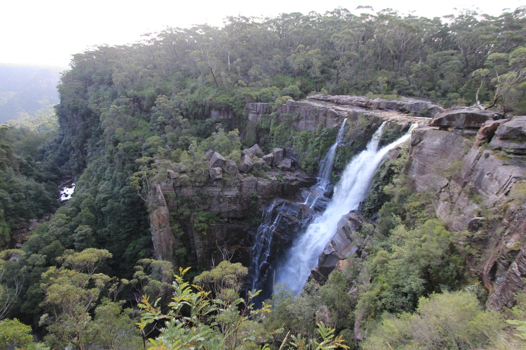
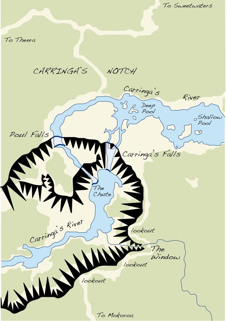
I continue with my series of Southern Highlands escarpment waterfalls, today reviewing the first of three within half an hour’s drive of each other. The easternmost of the three is Carrington Falls, my favourite of all the escarpment falls.
Carrington
Falls is easily accessible, a couple of kilometres down a sealed road off Jamberoo
Mountain Road, an alternative route from the Illawarra coast to Mittagong and
Moss Vale. The road up from Kiama is spectacular, with great views of the coast
and magnificent rainforest, worth the drive on its own.
Mist at Jamberoo Lookout
The car park is only a few minutes’ walk from the falls, and at least one of the three lookouts is wheelchair accessible. The first lookout gives a front-on view, while the second (and better) lookout gives a near side-on view of the falls and a great view down the gorge below the falls. The third lookout offers more of the same.
First LookoutSecond LookoutThird Lookout and Gorge
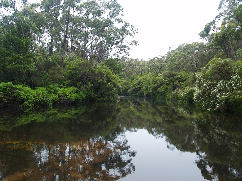
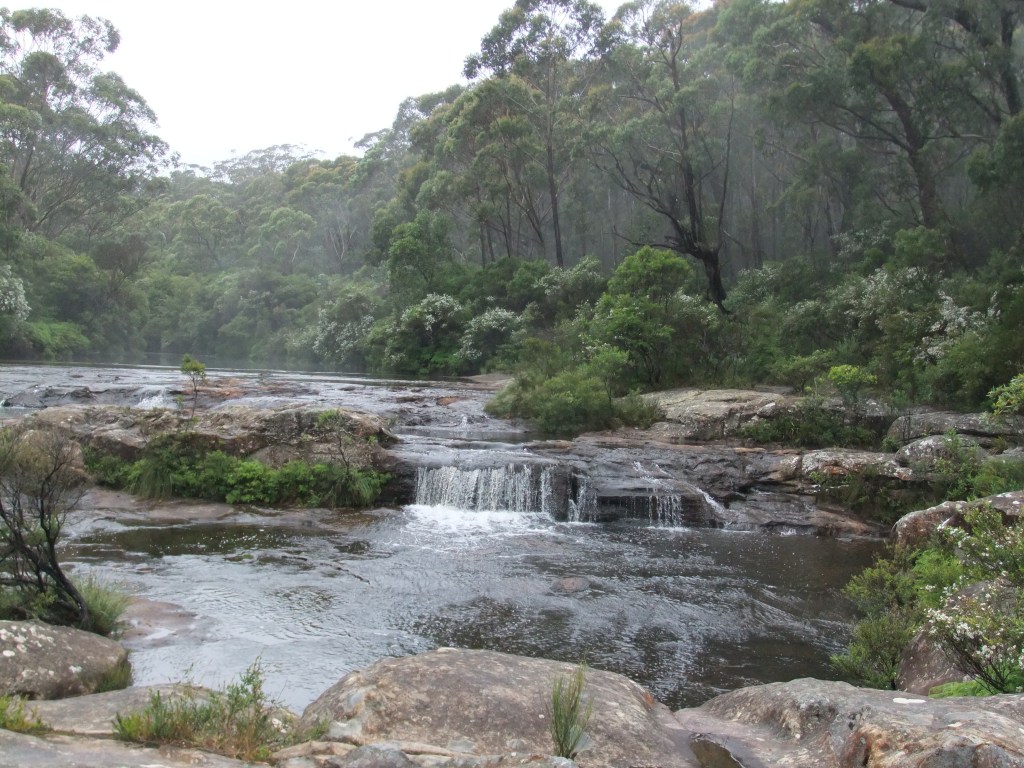
To add to the experience it is possible to find one’s way to wonderful swimming holes above the falls, as the stream spreads out over the hard caprock.
Above the falls
As with almost all the escarpment waterfalls, it is impossible to access the base of the fall, so viewers miss the full impact.
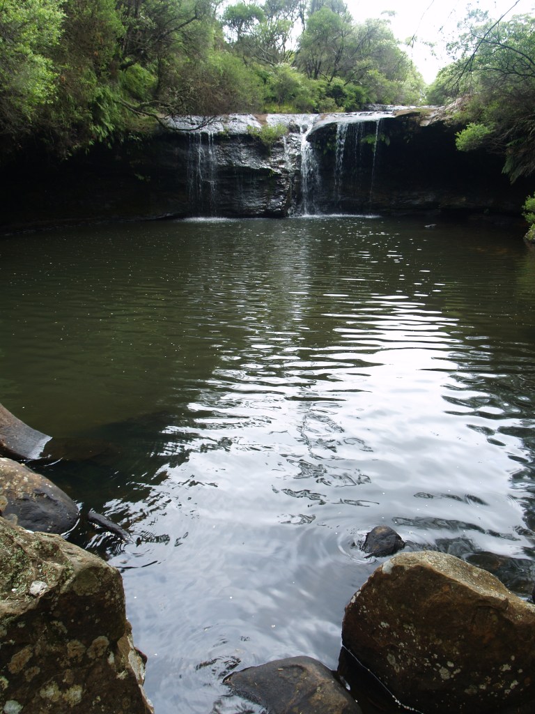
An extra
bonus is Nellies Glen, a lovely little freshet and swimming hole a few minutes’
walk north of the main waterfall.
Nellies Glen
A severe
bushfire swept through the area in 2016, destroying many of the safety fences,
and the waterfall was closed to the public for over a year. The precinct
recently reopened, but you should check before travelling there. The website
currently advises of partial closures and temporary disruptions.
Carrington Falls impressed me enough that it has ended up in my in-progress fantasy novel, Bitter Harvest, as a battle site. A visit to this waterfall offers a high quality experience all round.