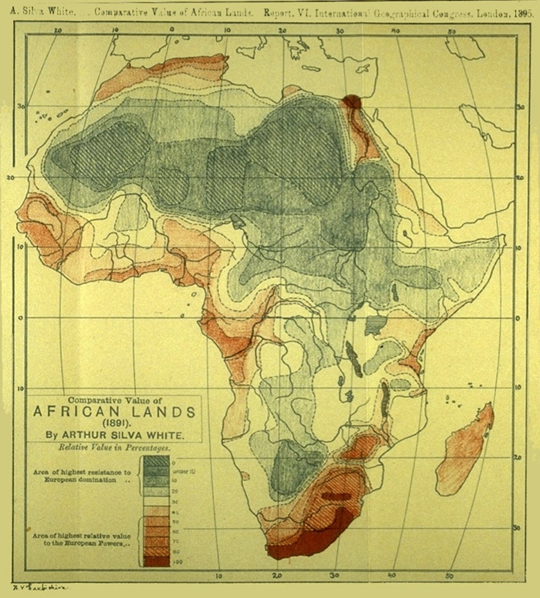
Last week I promised that this week I would begin presenting alternatives to our tired, misogynistic, colonialist mapping system, and show you some new maps that might accompany bold new visions in the speculative fiction genre. I’m renegging on that promise as I find I still have to do some theoretical groundwork.
It’s helpful to consider a map as being made up of two vital components: the map form (the cartographic decisions such as linework, typography, scale, projection and overall ‘feel’) and the map content (what the map is about, the data themselves). Thinking like this about maps allows us to imagine quite different ways of altering a map’s message, which is a combination of its form and content. We can, for example, introduce innovative content (such as last week’s 1989 Fear Map of UC Campus) and display it using traditional means. Or, we could come up with a new map form, where we vary some parameter of the traditional approach to mapping (such as the map projection), but slap traditional data sets on top of it. Or we could do both – that is, altering both the map form and content to create something entirely new.
There are a few examples of these about and I will showcase some over the next few weeks. In each case I will give a little detail of their history and how they might be used (or how I have used them).
Here’s this concept expressed in the form of a simple matrix. (I came up with this concept as part of my Master’s thesis in 1987.) I use the blurry categories of traditional and innovative to express the notions of ‘in service to the patriarchal/colonialist hegemony’ (traditional) and ‘something different’ (innovative). Sorry if those sound rather banal.
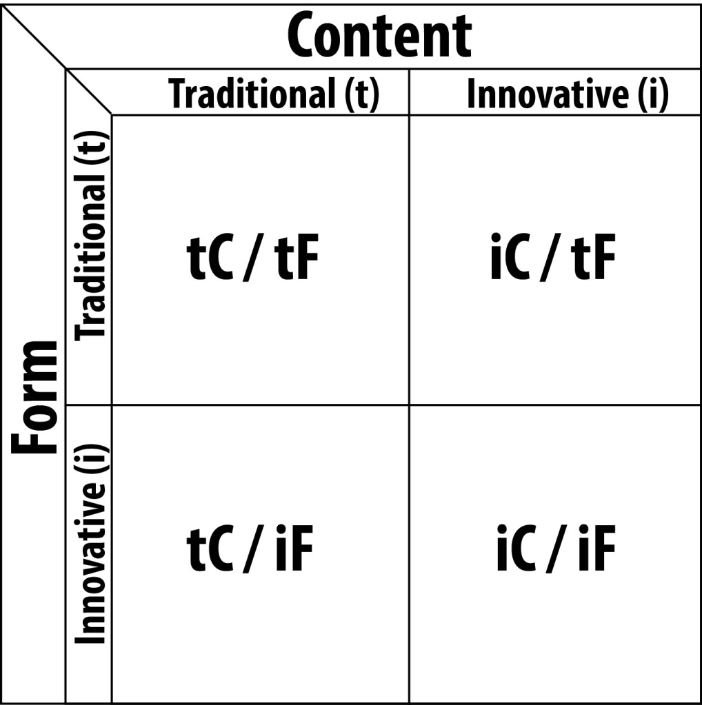
It’s a useful tool to interrogate / deconstruct cartography. Which box does a particular map fit into, we ask? Is the map form traditional? Whose interests does that tradition serve? What about the content? And – harder – what kinds of spatial data do NOT lend themselves to traditional mapping? Why not? What new forms could we create to showcase that data? It’s only in this way that we can come to a new, more inclusive cartography.
Examples next week, I promise.